

Turn Random Mobile Screens Into a Clean UI Style Guide
Create a simple starter UI style guide from messy mobile app screens.
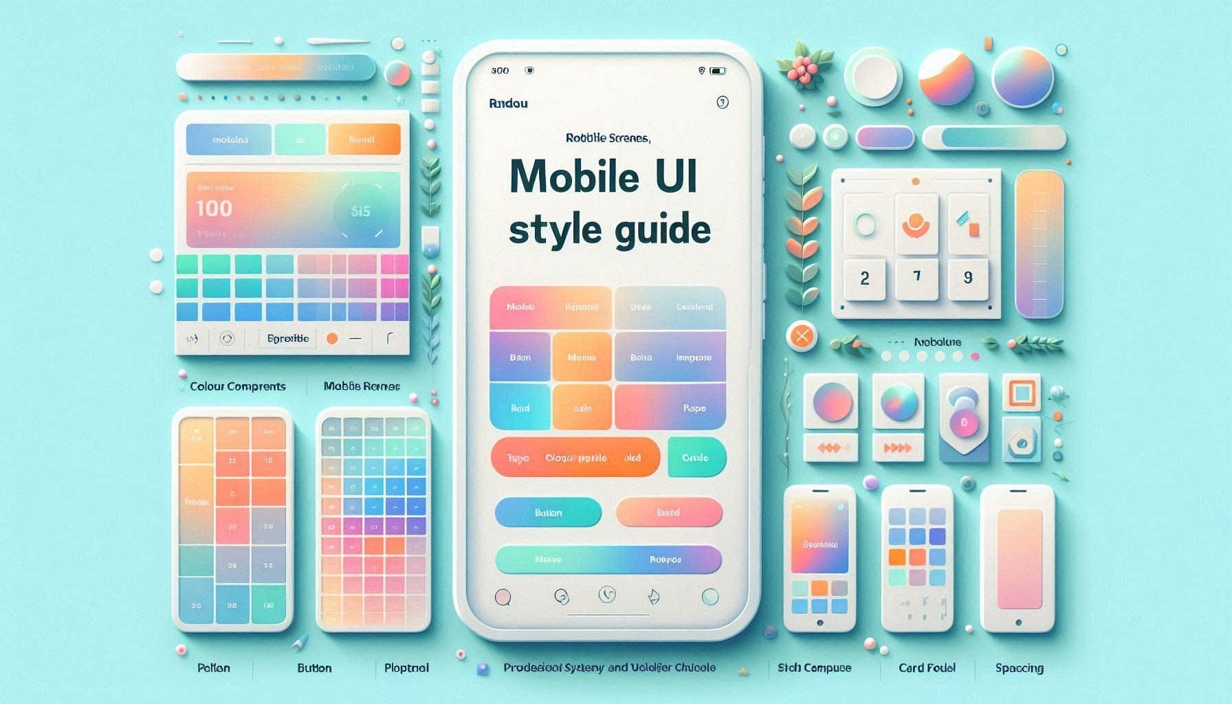
Prompt Overview
Tips For You
A starter style guide should reduce choices, not add more. The goal is to make the next screen easier to design and harder to make inconsistent.
From Operations TeamNexusAi TechnologyProblem It Solves
Many designers and founders create several screens before defining the basic visual rules. The result is a mobile app that feels random, even when each screen looks decent. This prompt turns existing screens into a simple style guide that can guide the next design pass.
Starter Style Guide
Turns messy UI direction into simple visual rules.
Component-Friendly Rules
Defines buttons, inputs, cards, and typography in a reusable way.
Beginner Figma Checklist
Shows what to create in Figma first for faster consistency.
AI Prompt Instructions
Act as a mobile app UI designer who helps early-stage founders and designers create clean visual style guides from existing screens.
I will describe or upload my mobile app screens. Your task is to create a lightweight UI style guide that makes the app feel more consistent without becoming too complex.
App context:
- App name: [insert app name]
- App type: [insert app type]
- Target users: [insert users]
- Screens available: [insert screen list]
- Current style: [describe current style]
- Desired feeling: [premium / clean / friendly / bold / calm / playful / professional]
- Brand colours if available: [insert colours]
Create a simple UI style guide with the following sections:
1. Visual Direction
Describe the overall look and feel the app should follow.
2. Colour Rules
Suggest primary, secondary, background, surface, border, success, warning, and error colour usage. Keep it simple and avoid too many colours.
3. Typography Rules
Define heading, body, label, button, and caption usage.
4. Button and Input Rules
Define primary button, secondary button, disabled state, input field, and form spacing rules.
5. Card and Layout Rules
Define card radius, shadow usage, spacing rhythm, section padding, and screen layout consistency.
6. Icon and Illustration Rules
Explain how icons or illustrations should be used consistently.
7. Figma Setup Checklist
Give me a checklist for creating the style guide in Figma using styles and reusable components.
Keep the guide simple, practical, and easy for a beginner to apply.
Expected Outcome
A lightweight mobile UI style guide with visual direction, colour rules, typography rules, button/input rules, card/layout rules, icon guidance, and Figma setup checklist.
Implementation Journey
Generate the starter guide in ChatGPT, Claude, or Gemini
Paste the promptText with your app type, screenshots or screen descriptions, current style, and desired feeling. Expect a simple UI style guide you can apply immediately.
6–10 minutesCreate styles and components in Figma
Turn the output into Figma colour styles, text styles, button components, input components, card components, and layout spacing rules.
30–60 minutesUse the guide on one screen first
Apply the style guide to one existing screen before updating the whole app. Then compare the updated screen with the original to confirm the style feels cleaner and more repeatable.
20–30 minutes